How I build

I design it. Then I build it, with agents in the loop.

I design agentic systems for a living, and I build my own products the same way: agents in the loop, from first sketch to deployed. Five of them are live right now. What follows is the working method: the loop, the code I threw away, how I prompt, and what no agent touches. If you’re deciding whether “designer who ships” is real here, this is the page that settles it.

01

The loop: design in Figma, build in real code

My loop is tight. An idea becomes a deployed, working page in an afternoon, not a two-week sprint. I design the system in Figma, then build it in production code with Claude Code as a pair. I’m reading every diff, naming the components, and making the calls. The agent is the fastest pair I have ever worked with; it is not the designer.
5live products, designed and coded end to end
40+EverWorker UI states, rendered at 2x
1day, typical idea-to-deployed for a page
100%of my shipped front ends are production code
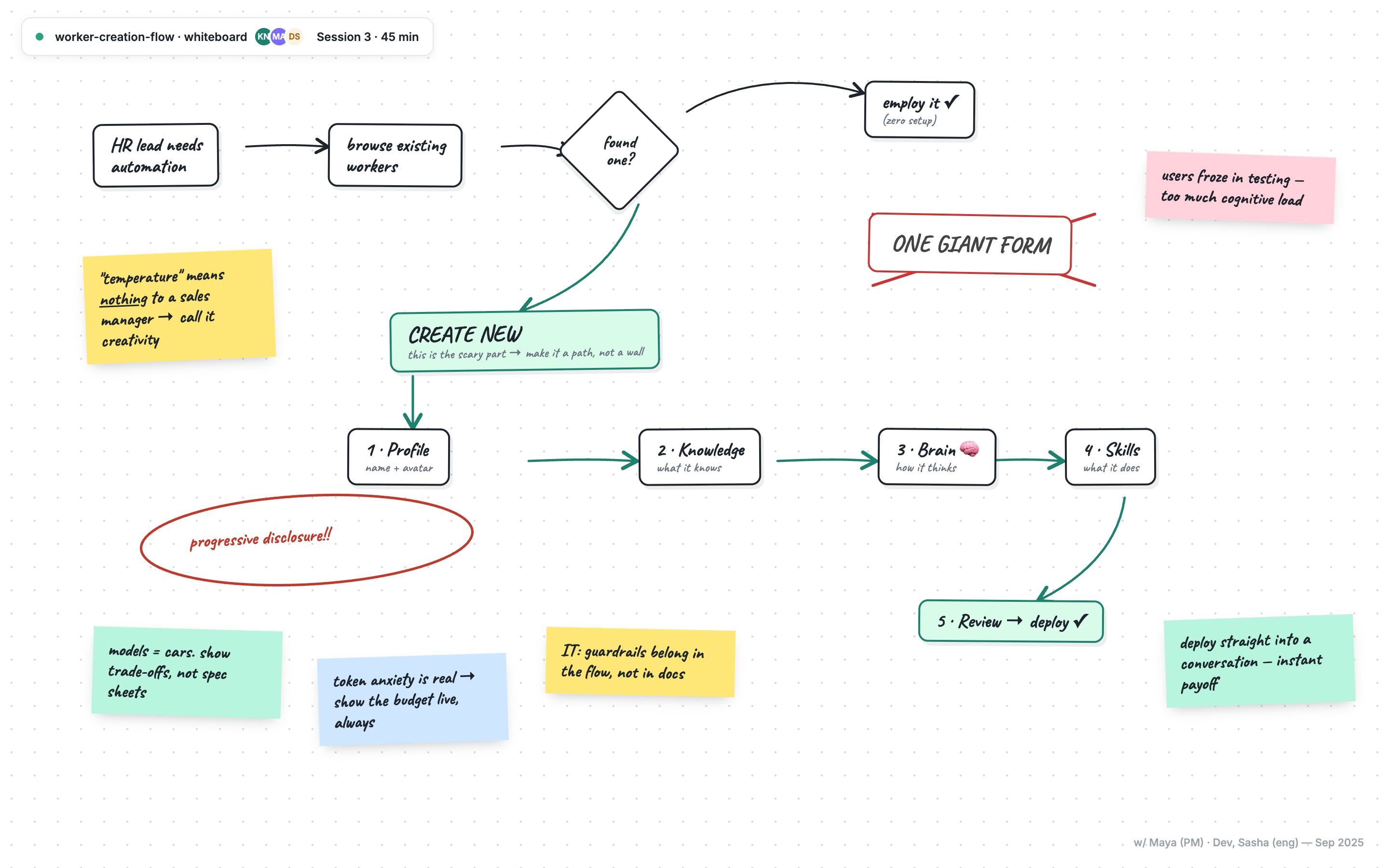
Whiteboard session: mapping the worker creation flow with PM and engineering
Sketch. Whiteboard session 3, 45 minutes with PM and engineering. “Make it a path, not a wall” became the wizard.
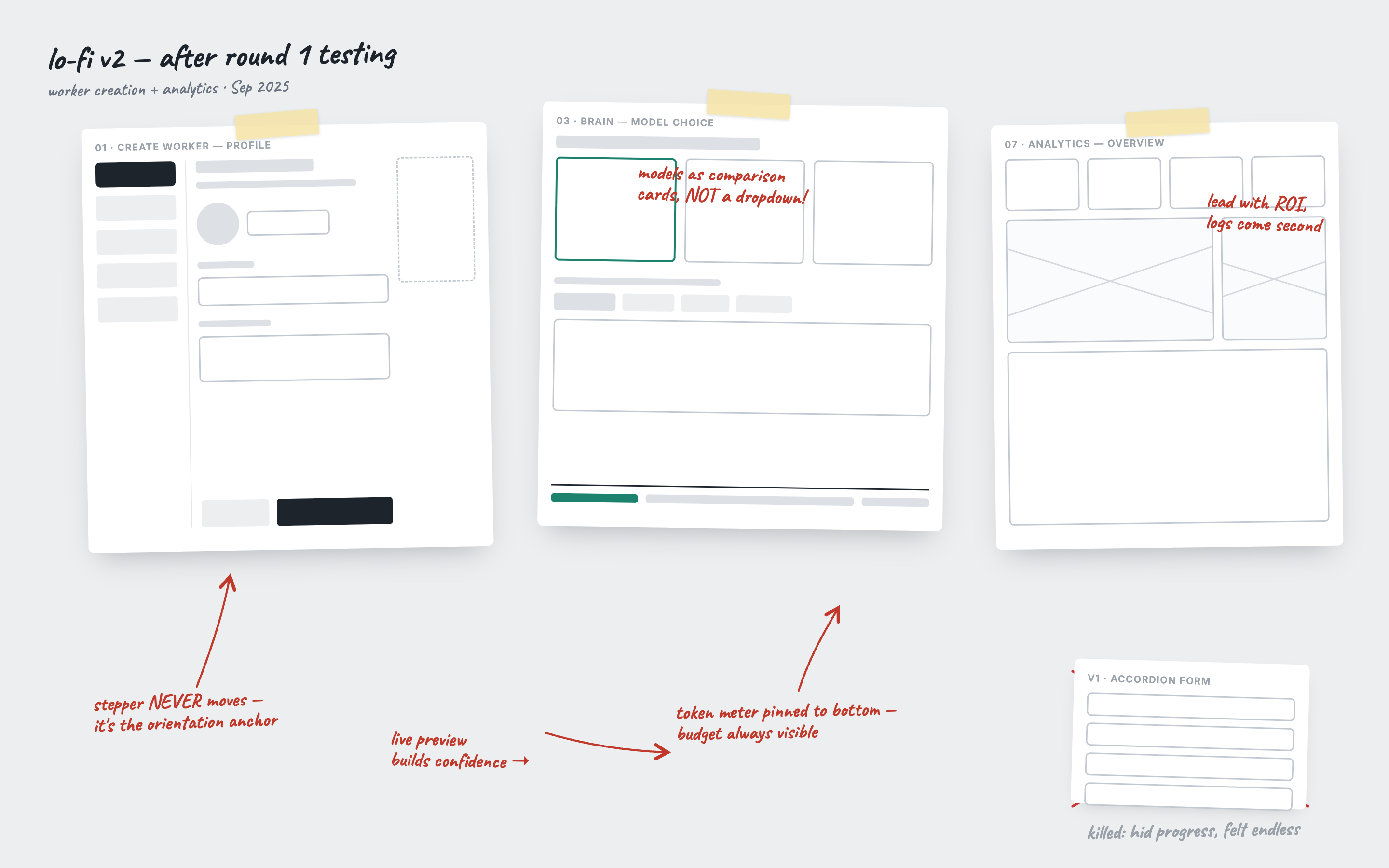
Lo-fi wireframes with annotations from usability testing
Test. Lo-fi wireframes after round one of testing, with the killed takes still taped up.
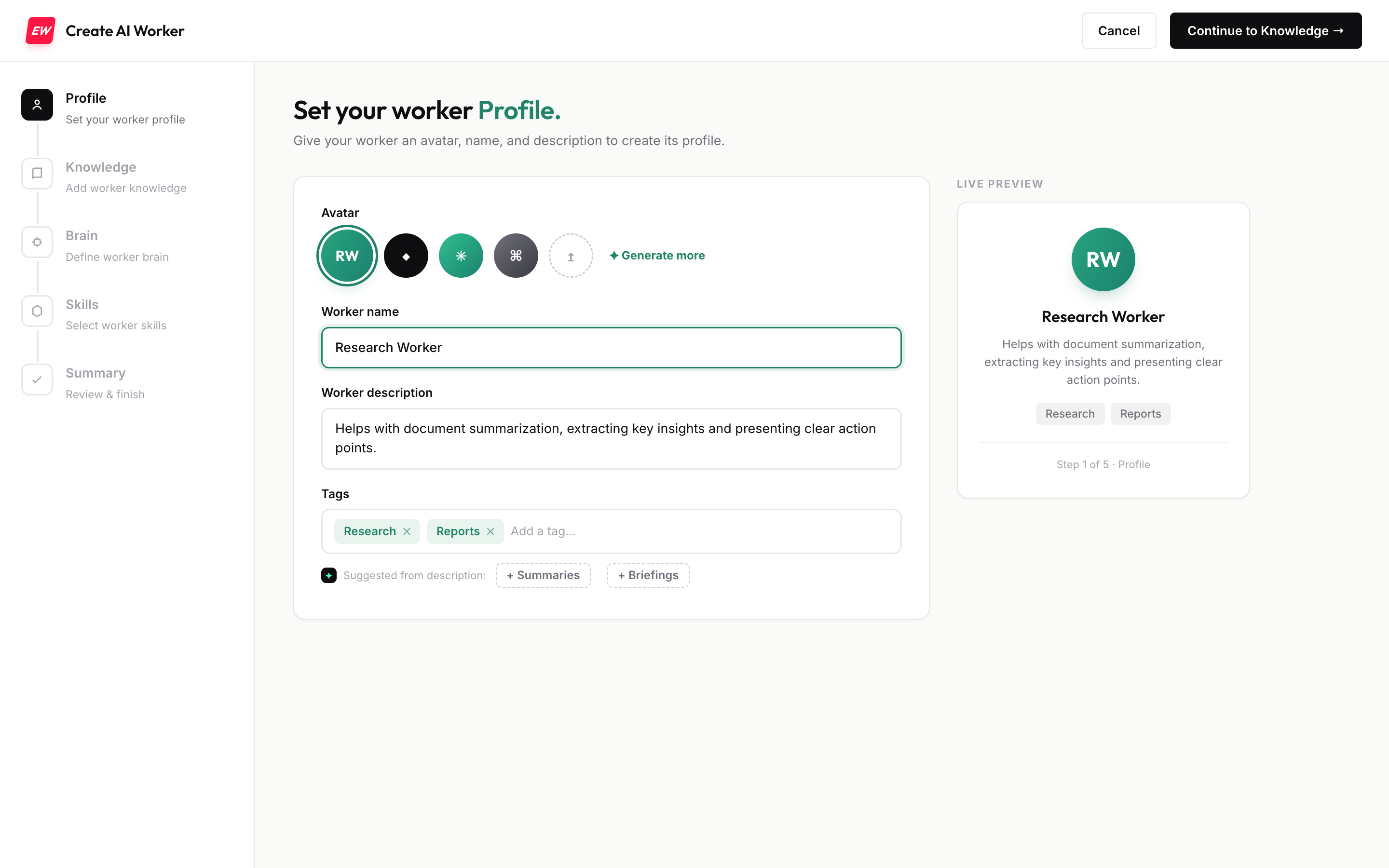
The shipped Profile step with live worker preview
Ship. The same flow in production code, live preview and all.
Why it matters: the gap between “designed” and “shipped” is where most portfolios stop. Closing it myself means I feel every constraint the engineers feel: the empty states, the error paths, the latency. The design gets better because I lived in the build.
02

Scope before execution

I groom the work before a single line is written. Before any branch, I write a one-page brief: the persona, the primary job to be done, the states that matter (empty, loading, error, success), the tokens, and a hard definition of done. Then the agent and I read the relevant files together, so the constraints surface before the build, not mid-diff.

It is far cheaper to change a decision in a sentence than in a diff. By the time I’m prompting for UI, the hard calls are already made, so the agent is executing a plan instead of guessing at one.
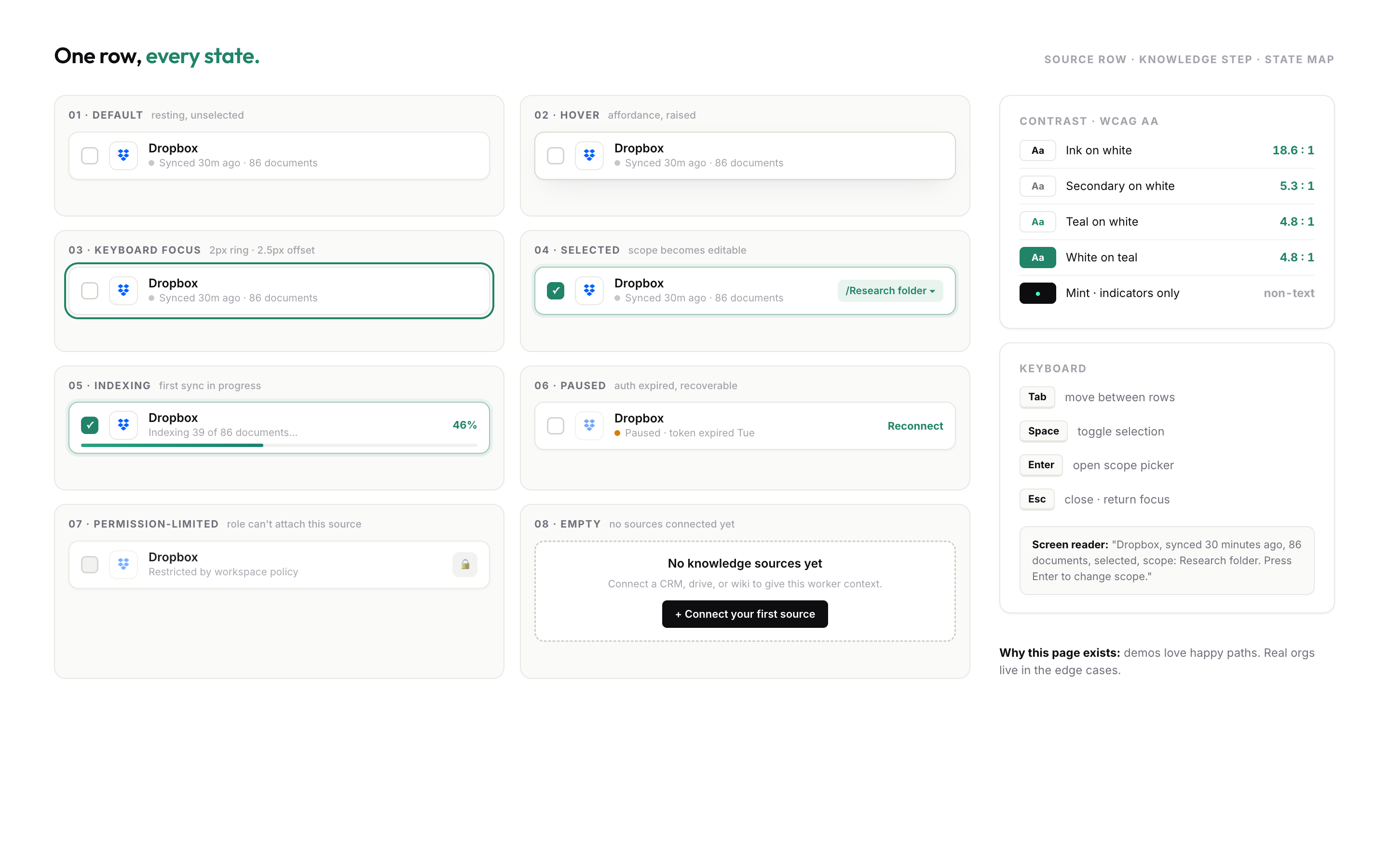
State map: eight states for one knowledge-source row, with contrast, keyboard, and screen reader specs
What “the states that matter” looks like written down: one row, every state, with contrast ratios and keyboard behavior decided before the build.
My rule: if I can’t write the done-criteria in one line, the work isn’t scoped yet, and I don’t start it.
03

Three times I threw away code that worked

Working is not the bar. Some of my best decisions were deleting a clean, functioning build because it solved the wrong problem. Three examples, all shipped:
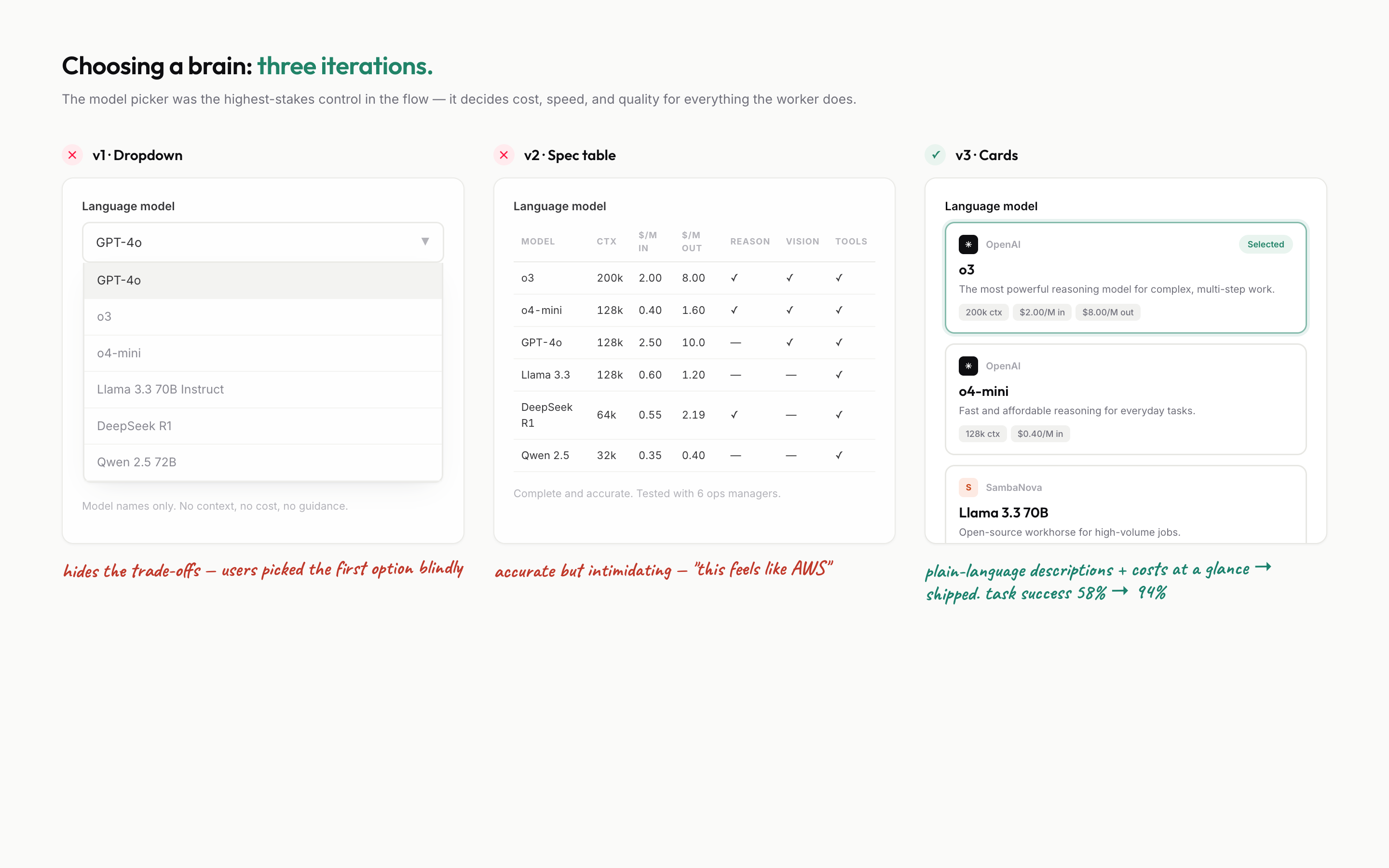
Three iterations of the model picker: a dropdown and a spec table were deleted, plain-language cards shipped
Deleting, documented. Two working model pickers were thrown away before the third shipped: the dropdown hid the trade-offs, the spec table read like AWS, and the cards took task success from 58% to 94%.
The cost meterEverWorker
Before

Cost appeared once, on the final summary screen. The build worked and the math was right.

After

A live meter, pinned to the exact step where you add the skills and knowledge that drive cost, ticking up as you go.
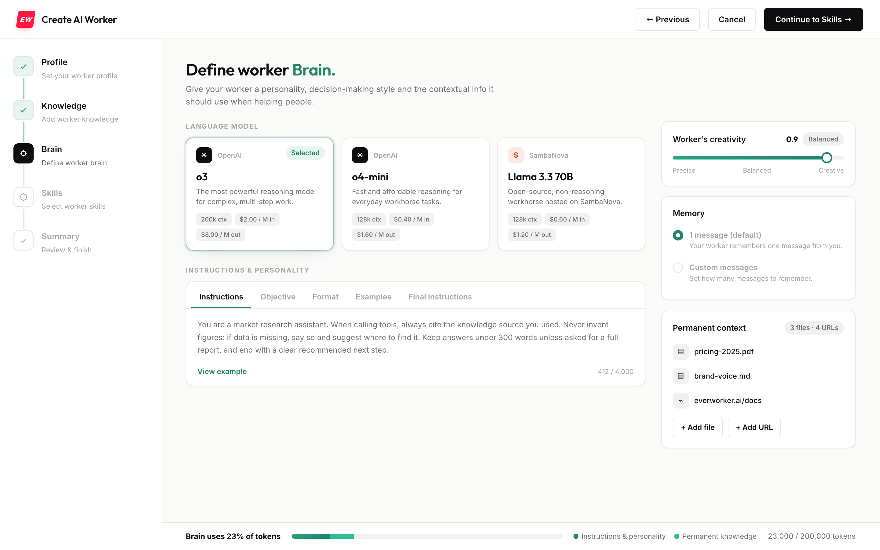
The shipped Brain step with the token budget meter pinned to the bottom edge
The shipped step. The budget never leaves the bottom edge, priced per model on the cards above it.
Why: cost anxiety surfaced in every interview. Hiding the number until the end is technically fine and completely wrong. Named in the moment, it’s what made people confident enough to deploy.
The phone lineSpeedyFixers
Before

A live AI voice answered and handled calls end to end. A flawless demo.

After

Pre-recorded, human-sounding audio. I tore the live AI voice out completely.

Why: callers were hanging up the second they heard a bot. “Working” is not “converts.” The only metric that mattered was calls that stayed on the line, and only a human voice moved it.
The walkthrough deckThis portfolio
Before

Eight sequential slides walked through the full design progression. Complete, accurate, done.

After

Two slides: the one key moment, and why it happened.
Why: ten screens flashed for two seconds each are remembered as zero. Fewer, held longer, land. I would rather they remember one decision than forget eight.
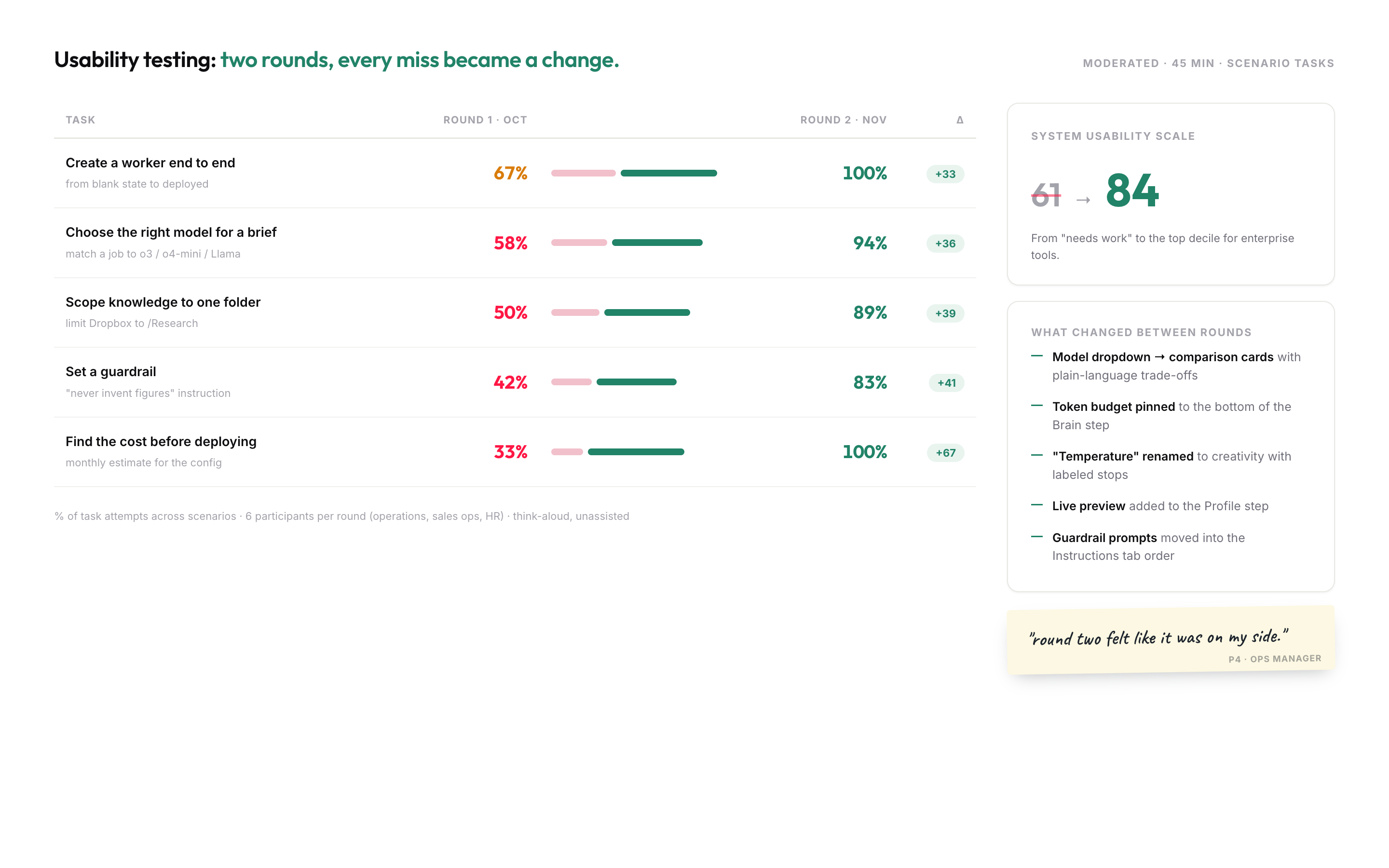
Usability testing scorecard: five tasks over two rounds, SUS 61 to 84
The scoreboard for all that deleting. “Find the cost before deploying” went from 33% to 100% once the meter moved into the flow; SUS went from 61 to 84.
04

How I prompt: in the language of the system

I don’t prompt in pixels. I prompt in the vocabulary of the system: tokens, states, contrast ratios, motion timed to real latency, and rules instead of symptoms. One precise sentence carries four decisions and prevents a round of follow-up questions.
Craft level Tighten the vertical rhythm in the worker card: drop the label-to-value gap to 4px, tint the labels toward teal but hold AAA contrast, keep the number in Fraunces 550, and time the “thinking” shimmer to ~1s so it matches the real model latency.
A rule, not a symptom Don’t just fix this one clipped header. Every sticky element in the app should reserve its own height and never overlap scrolled content. Fix the layout primitive, not this instance.
Context up front Persona: a finance lead, non-technical, anxious about cost. Primary job: stand up one AI worker and trust it enough to deploy. On the review step, make the single most reassuring fact, the cost per run, the largest thing on screen.
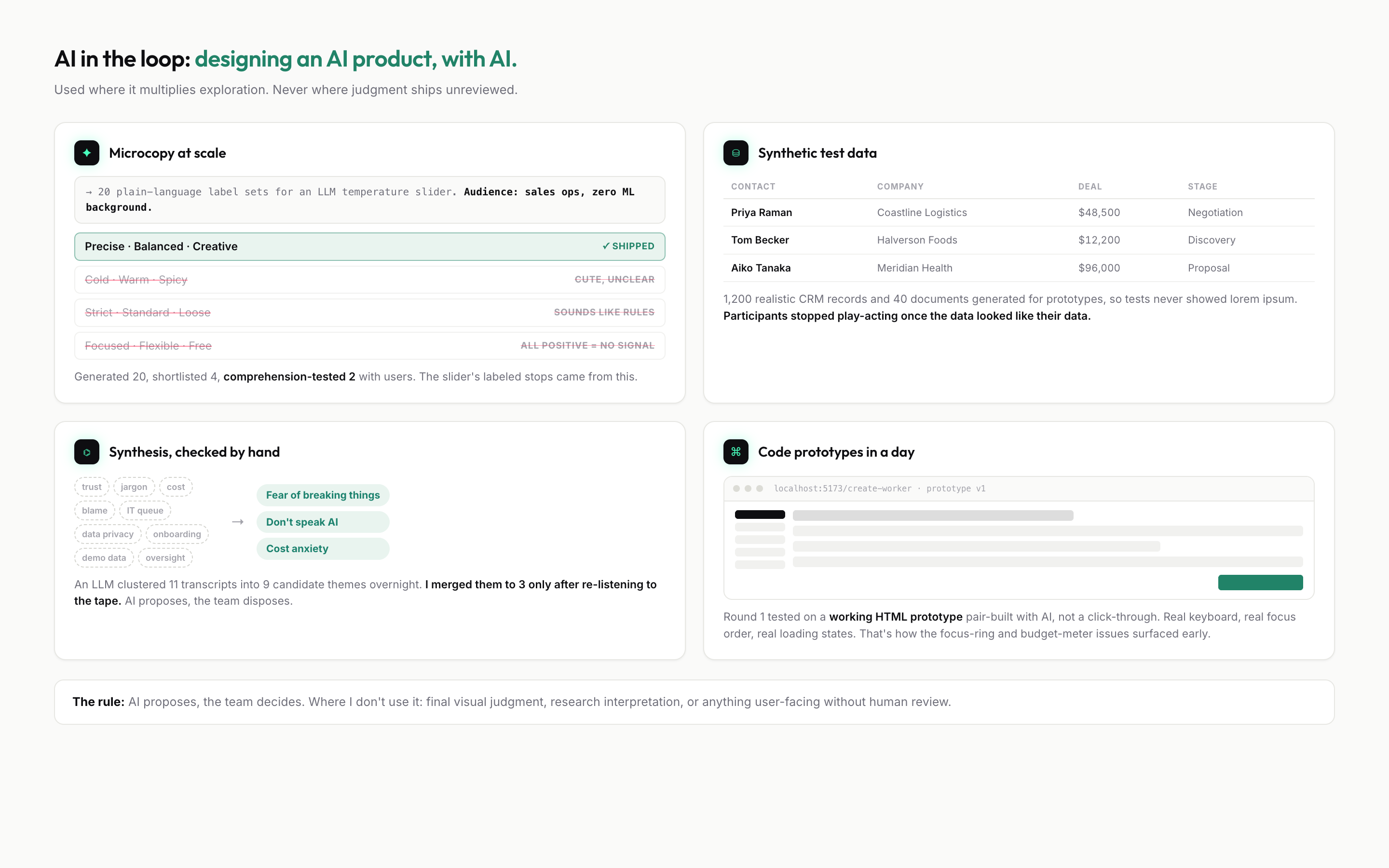
AI in the loop working file: microcopy exploration, synthetic test data, hand-checked synthesis, and a code prototype
What that vocabulary buys. Generated label sets comprehension-tested down to the one that shipped, synthetic CRM data so tests never showed lorem ipsum, and themes the model proposed but I merged by hand.
The pattern: good prompts read like a design spec, because that is what they are. The better my vocabulary, the better the output, and the fewer the rounds.
05

Ship it for real

Design that lives in a Figma file is a proposal. I close the last mile myself: production React, deployed to Vercel, Replit, or Railway, with the analytics, empty states, and error paths that only show up once real people touch it.

UIScore, Sniffs.ai, SpeedyFixers, Pawsh, and this site are all live, designed and coded end to end. Shipping is not the last 10% of the work. It is where half the real design decisions actually get made.
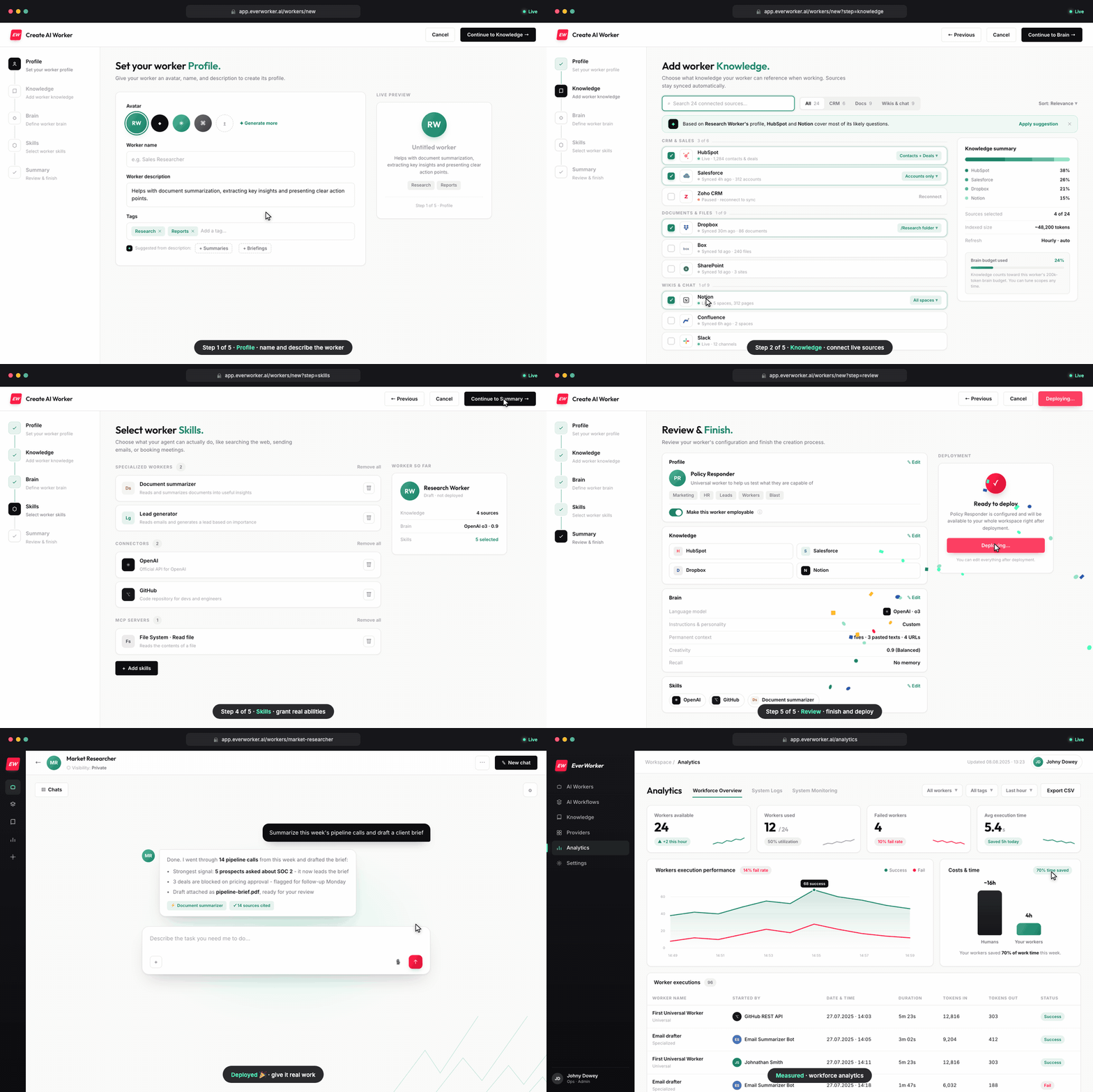
Creating an AI worker in five steps in the live product, then the worker running in chat and analytics
Not a prototype. The five-step wizard recorded from the deployed app, ending with the worker live in chat and workforce analytics.
06

What the agent doesn’t do

The agent makes me faster. It does not make me a designer. Three things stay entirely mine:

  • Taste. An agent will happily ship the average of the internet. Deciding what is actually good, and killing what is merely fine, is the whole job.
  • The research. The three fears that shaped EverWorker came from eleven interviews and six shadow sessions, not a model. AI can synthesize notes; it cannot sit in the room.
  • The outcome. If it ships broken, that is on me, not the tool. Every diff gets read; every call gets owned.
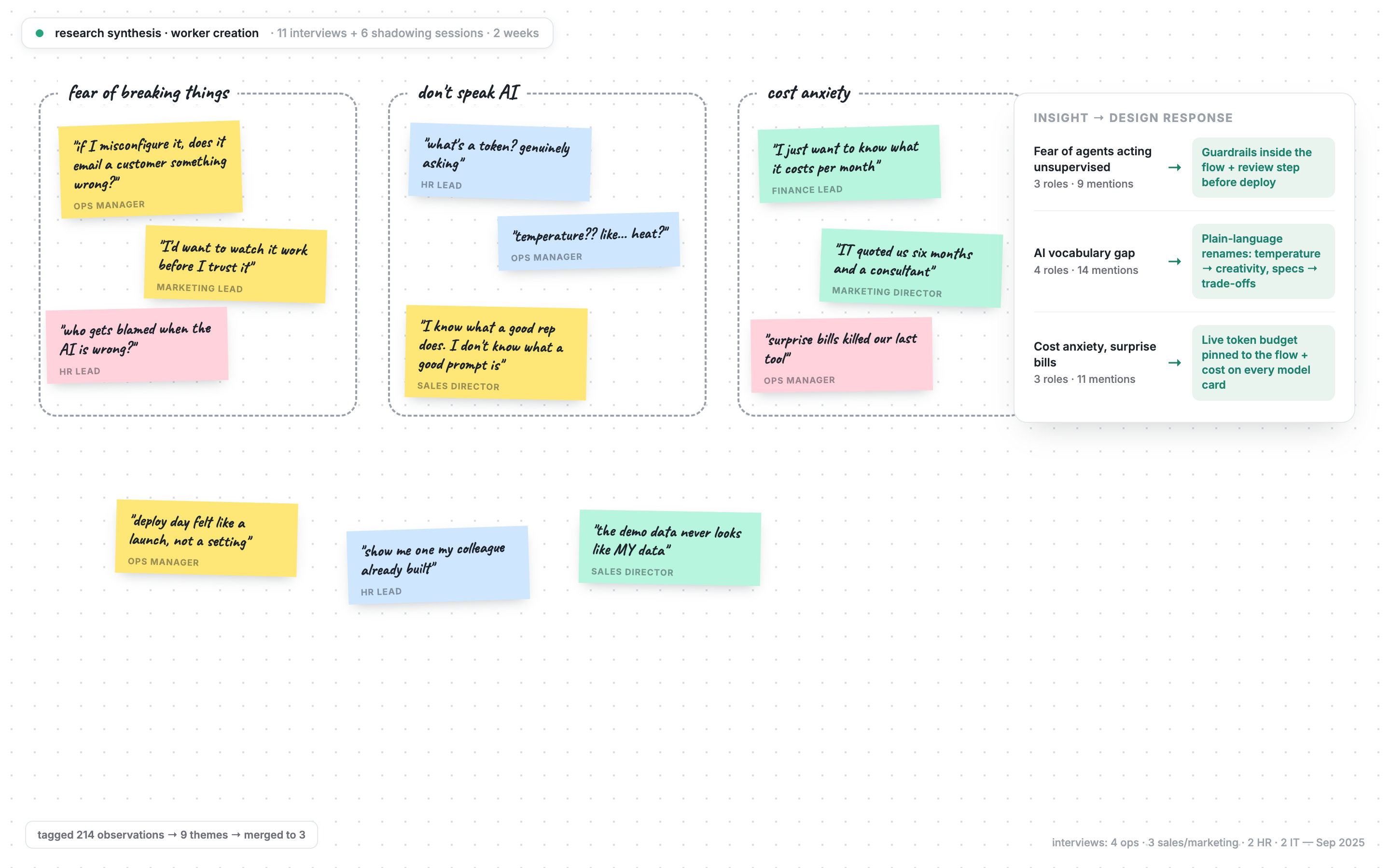
Research synthesis wall: 11 interviews and 6 shadowing sessions, 214 observations merged into three themes
The room the model can’t sit in. 214 tagged observations from 11 interviews and 6 shadow sessions, merged into three fears; the “cost anxiety” cluster is where the cost meter above came from.

Speed is the agent’s job. Judgment is mine.

The bar everything clears

Legible. Trusted. Built.

Shipped this way